I am using a custom dashboard to display the status of a performance counter for all my routers. It shows me whether a router has failed over to a backup link or not. If the performance counter value is 5 (green), its normal and if its 1 (red) then its failed over to the cellular link. I have about 100 routers. Its very clumsy and very laborious to create such a dashboard. Needs lots of refinement. I have attached the screenshot of my dashboard and see how ugly it looks.
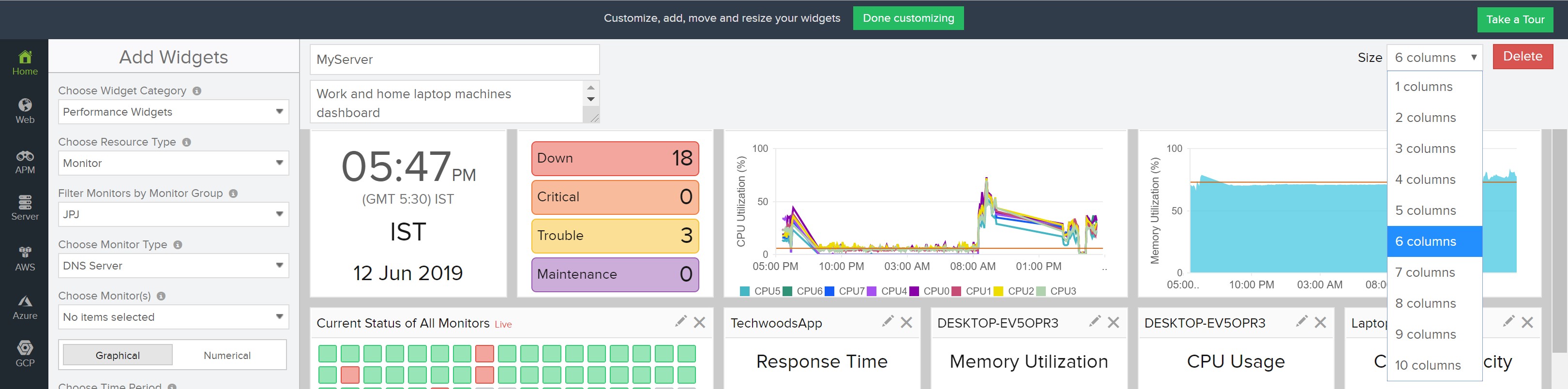
1. First of all, for 100 routers I have to add widgets for one router at a time, even though they are a part of the same monitoring group and same manufacturer model, and I am using the same performance counter for all routers. Who has got time for this?
2. What value its adding in the widget dashboard displaying "Dial Value" word. Neither I can edit, nor I can remove it. Same goes for the word "Units", isn't it the units is obvious why do you have to display it? Dashboard space is precious, use it wisely. Focus here should be the name of the monitor and the performance counter value. That's it, and the name of the performance counter as an option to either display or not based on customer choice.
3. If I have missed a site and then want to add it at a later date, I can add it but it goes at then end. No way I can drag it in a position to rearrange alphabetically. If I drag a panel somewhere up, it pushes all other panels vertically down for one column only, which messes up everything. The desired behaviour should be to push all the panels to the right. If this is not feasible, at least allow user to sort widgets in the dashboard alphabetically by the name of the monitor/widget.
Please apply some logical thinking with the main aim to reduce customer pinpoints and offer flexibility.
My apologies being too critical here, but point me if I am wrong.
Dear Ash,
I can understand the pain points that you have mentioned. Thank you for sharing your experience with us. Your feedback is much appreciated and it only improves the product. We'll go through each of the points mentioned & more and rectify them where ever possible.
>>I have about 100 routers. Its very clumsy and very laborious to create such a dashboard. Needs lots of refinement. I have attached the screenshot of my dashboard and see how ugly it looks.
The screenshot of the dashboard you have given is in edit mode. Please click on "Done Customizing" at the top. Have a look at it and let us know if its better.
>>>1. First of all, for 100 routers I have to add widgets for one router at a time, even though they are a part of the same monitoring group and same manufacturer model, and I am using the same performance counter for all routers. Who has got time for this?
We'll reduce the cumbersome addition steps.
>>> 2. What value its adding in the widget dashboard displaying "Dial Value" word. Neither I can edit, nor I can remove it. Same goes for the word "Units", isn't it the units is obvious why do you have to display it? Dashboard space is precious, use it wisely. Focus here should be the name of the monitor and the performance counter value. That's it, and the name of the performance counter as an option to either display or not based on customer choice.
We'll bring in options to reduce the clutter at the widget level.
>>> Dashboard space is precious, use it wisely. Focus here should be the name of the monitor and the performance counter value. That's it, and the name of the performance counter as an option to either display or not based on customer choice.
Did you try to increase the size of the columns in the top right of the dashboard in edit mode? By increasing the no.of columns the no.of widgets in a row also increases. Please try it and see how it looks.
>>> 3. If I have missed a site and then want to add it at a later date, I can add it but it goes at then end. No way I can drag it in a position to rearrange alphabetically. If I drag a panel somewhere up, it pushes all other panels vertically down for one column only, which messes up everything. The desired behaviour should be to push all the panels to the right. If this is not feasible, at least allow user to sort widgets in the dashboard alphabetically by the name of the monitor/widget.
We'll look into how we can improve this and make it user friendly.
-Jasper
Product Manager, Site24x7
Thank you Jasper. I am glad that from the product team, you guys take customer feedback seriously.
To respond to your question, have I completed the "done customising", of course I did. I know what I am doing. Pl see the attached 2nd screenshot. Only reason I included the configuration parameter in my previous screenshot to help you to understand what performance counter I am adding in the widget in the dashboard. Ideally, I would like to display only the widgets for the routers that have performance counter current value = 1, but I guess, that is too complicated to accomplish.
On your question whether I tried to increase the column width, I know how to do it, but it does not help when I have 100s of devices to display.
I forgot to mention another issue. When selecting the option to display the colour range for the performance counter value, its very limited. I do not see any option to display like my requirement. e.g. if the value = 5, its green, if the value is between 2 and 4, its amber, if the value is 1 its red. To me it looks like the design of the widget was based on the assumption that the higher value means bad, but it can be other way too! You have to give that flexibility to the customer to decided based on their need.
One other flexibility would help is to allow customer to choose the font size of the title of a widget. Its Ok when I view the dashboard from my computer monitor, but when displayed over a wall even on a 60 inch monitor (main purpose of dashboards are to display in wall monitor so that my team can keep an eye on IT apps and infrastructure), it becomes illegible with the current size of the font. See my third screenshot. It would also be helpful to upload an image so that I know easily from the image which group of infrastructure is having trouble.
Please do post back when there is an update available. Thank you once again for listening.
Thank you for the explanation Ash. As mentioned in the other post on improving maps, we are planning on improving custom dashboard, especially for Network Monitoring. We'll take into account all these. Stay tuned.
-Jasper
Product Manager, Site24x7
Hi Ash,
>>>To me it looks like the design of the widget was based on the assumption that the higher value means bad, but it can be other way too! You have to give that flexibility to the customer to decided based on their need.
You can achieve this by changing the condition from <= to >= while configuring widget. Just the order of the color is not changeable.
Thillai.
Color code can be changed, Ash. You can configure green for either the higher or lower values based on your need. I have attached sample screenshots for both cases.
Hello Ash,
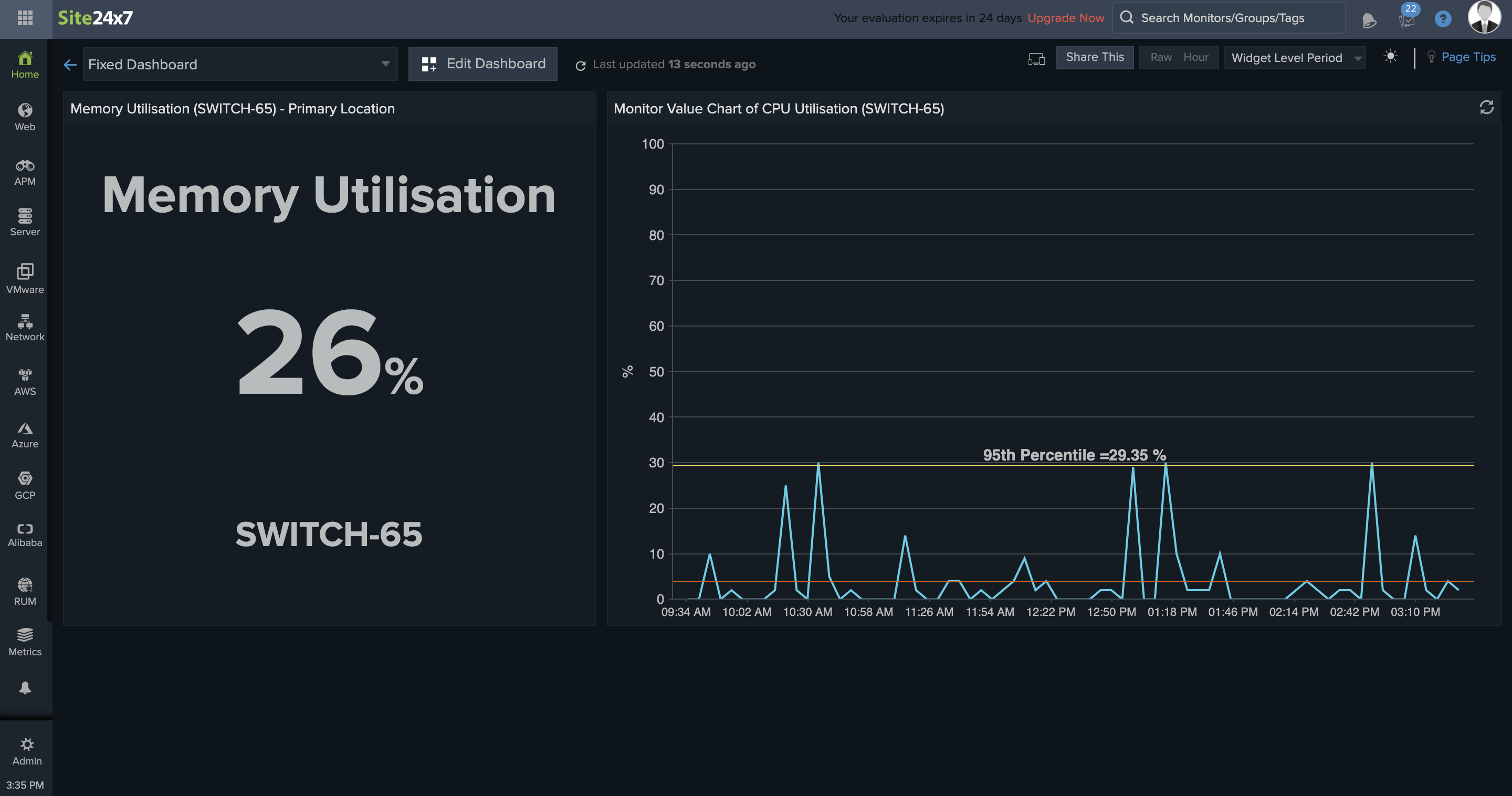
Your query 2 is now solved. We now display the exact unit and the rounded off value. Please refer to the screenshot and let us know your feedback.
Thanks,
Santhi